Covid-19 Mobility Deep Dive
What can US population mobility data tell us about Covid-19 stay-at-home trends?
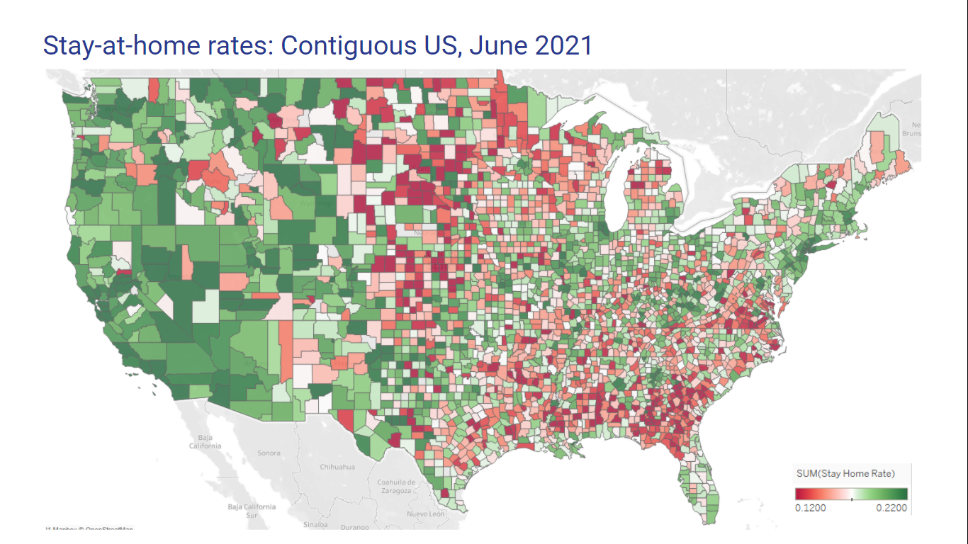
The Bureau of Transportation Statistics provides daily county-level mobility data from a mobile device panel, which are weighted to be representative of the US population. This was a snapshot in June 2021.
Stay-at-home rates have seen the largest increases in metro areas, and in counties with high recent case incidence rates.
- Stay-at-home rates have increased by an average of 26% compared to pre-Covid levels.
- The magnitude varies by geography and case incidence:
- Stay-at-home rates have seen larger increases in large metro areas (+31%) than rural areas (+11%).
- For every 100 cases per million residents in the last 14 days, the stay-at-home rate increases by an average 1.6%. Metro areas are the most sensitive.
- This is likely caused by multiple interdependent drivers such as lockdown measures and community concern.

There is early evidence of a permanent shift in mobility, particularly in high-income regions.
- While stay-at-home rates were similar across income levels before Covid-19, residents of the highest-income counties are now 1.2x more likely to stay at home than residents of the lowest-income counties.
- This remains true even after widespread vaccinations and relaxed restrictions, suggesting a permanent shift.
- There is evidence of the same effect between high- and low-income neighborhoods within counties as well.
- Reasons cited include the correlation between high-income and remote-friendly jobs, and greater ability to outsource household tasks.
The map of county stay-at-home rates looks a bit like the map of election results.

I used this Jupyter notebook to wrangle the data, and created the map in Tableau.
